uDream: Seamless Migration and Experience Alignment
The OSIM Well-Being App consolidates massage product experiences into one platform.
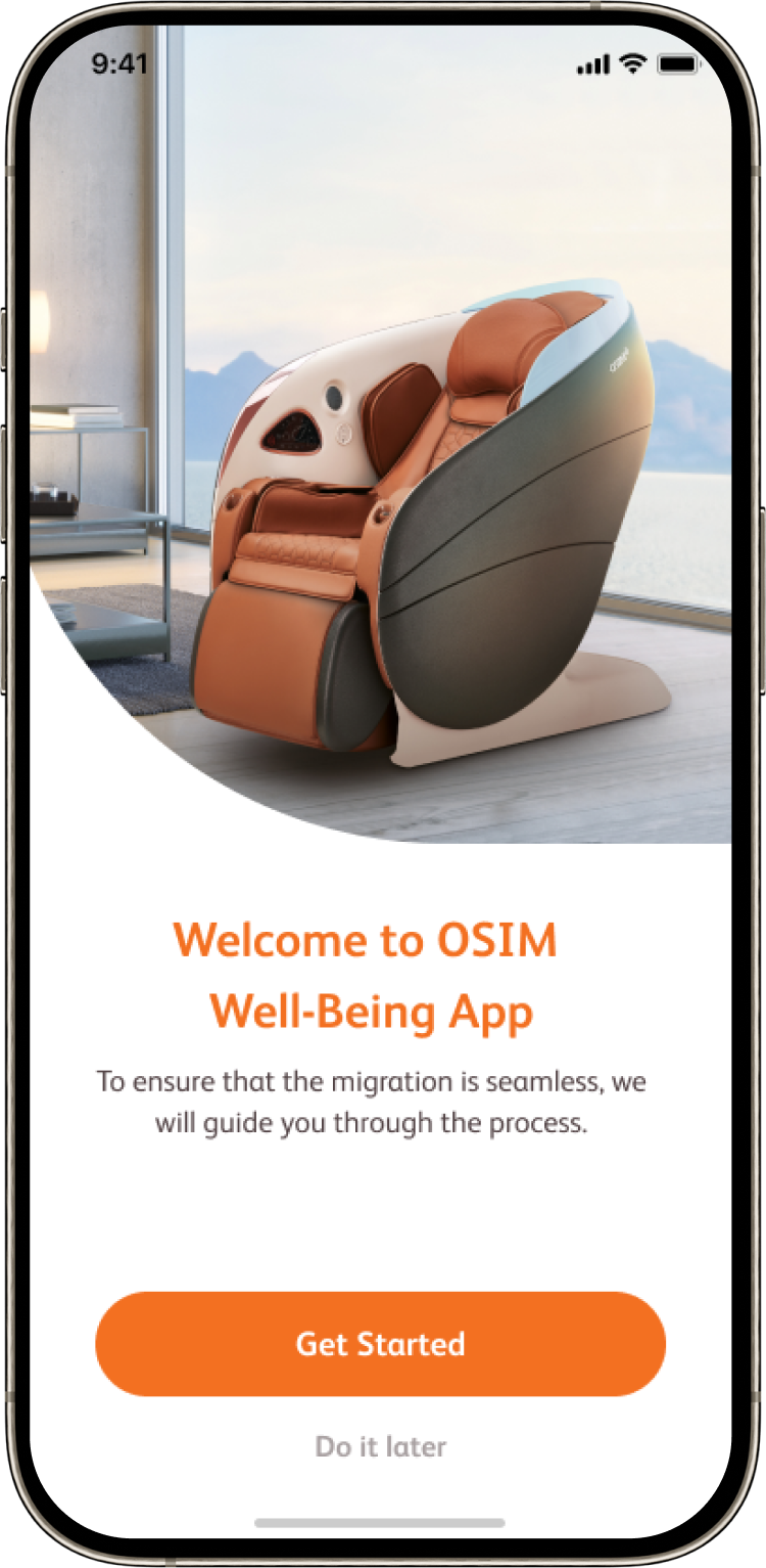
This project migrated a legacy control app into the new ecosystem, ensuring a smooth transition by preserving familiar interaction patterns and maintaining consistency across mobile and tablet.
Team: 1 Product Owner, 1 UI/UX Designer, 3 Developers, 2 Test Engineers
My Role: UX Research, Wireframe & Visuals, Design System, Design QA
Duration: 2022 Apr - 2023 Apr
Product Overview
-
Goal
Ensure existing users can adopt the migrated app with minimal relearning by keeping the experience consistent, predictable, and easy to follow across devices.
-
Solution
Aligned legacy and migrated interaction patterns, redesigned key flows for cross-device consistency, and visualized system states during hardware-driven waiting periods to reduce uncertainty and support confident use.
-
Impact
- 90% global migration success rate
- 5+ regions launched successfully
- 99% sales devices supported
Design Scope
Core behaviors were tied to the native app and hardware controls and could not be modified.
Design efforts therefore focused on interaction clarity, consistency, and experience refinement.
Tied To Native App And Hardware
“Ensure a smooth, consistent, and extensible user experience during app migration”
— Goal
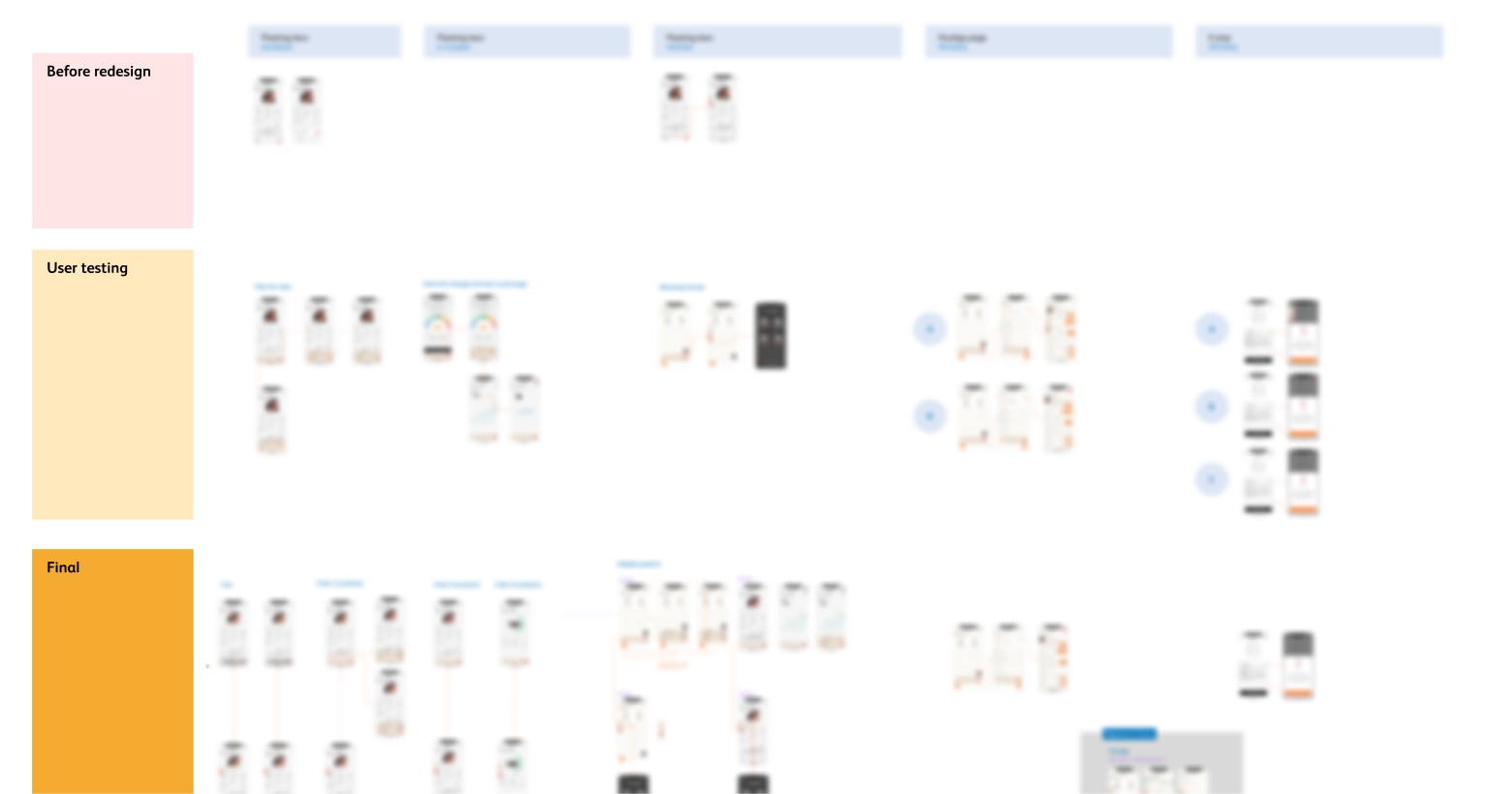
Research & Insights
Successful migration relies on preserving a familiar and consistent experience, while refining interactions based on existing user habits to minimize learning cost.
Key Insight
Research Overview
Reviewed the legacy app and related well-being apps to understand existing interaction patterns, terminology, and control behaviors across devices.
Legacy Experience Review

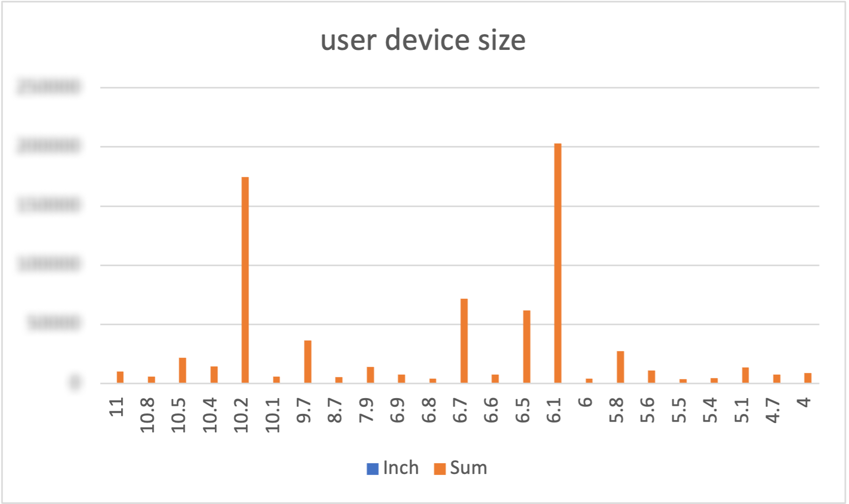
Analyzed usage data to understand massage interaction habits, including device usage patterns and commonly used massage options.
Data Tracking & Analysis

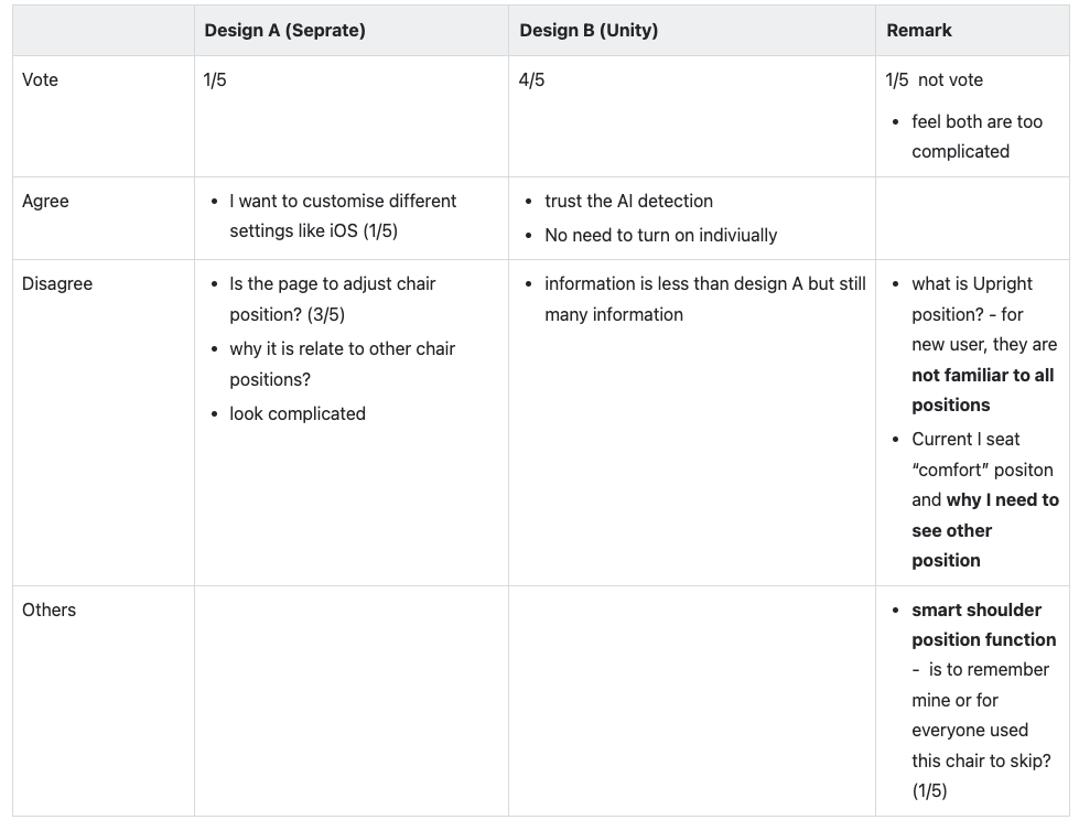
Collected internal usability feedback to evaluate whether the updated design felt familiar and easy to adopt for existing users.
Internal Usability Testing
What We Found
Mental Models Are Shaped By Prior Experience
Users who have used the product for some time are accustomed to the existing experience.
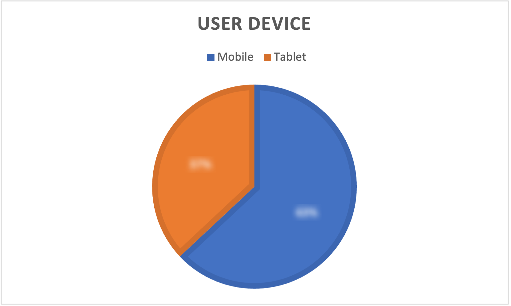
Tablets, which account for approximately 40% of usage, are often the first touchpoint during in-store demos and set initial expectations.
Focus On The Massage, Not The System Behind It
Users are often unfamiliar with internal terms and do not attempt to learn product or system logic.
Framing options from the perspective of the massage experience improves understanding and reduces cognitive effort.
Lack Of Visible Status Increases Uncertainty
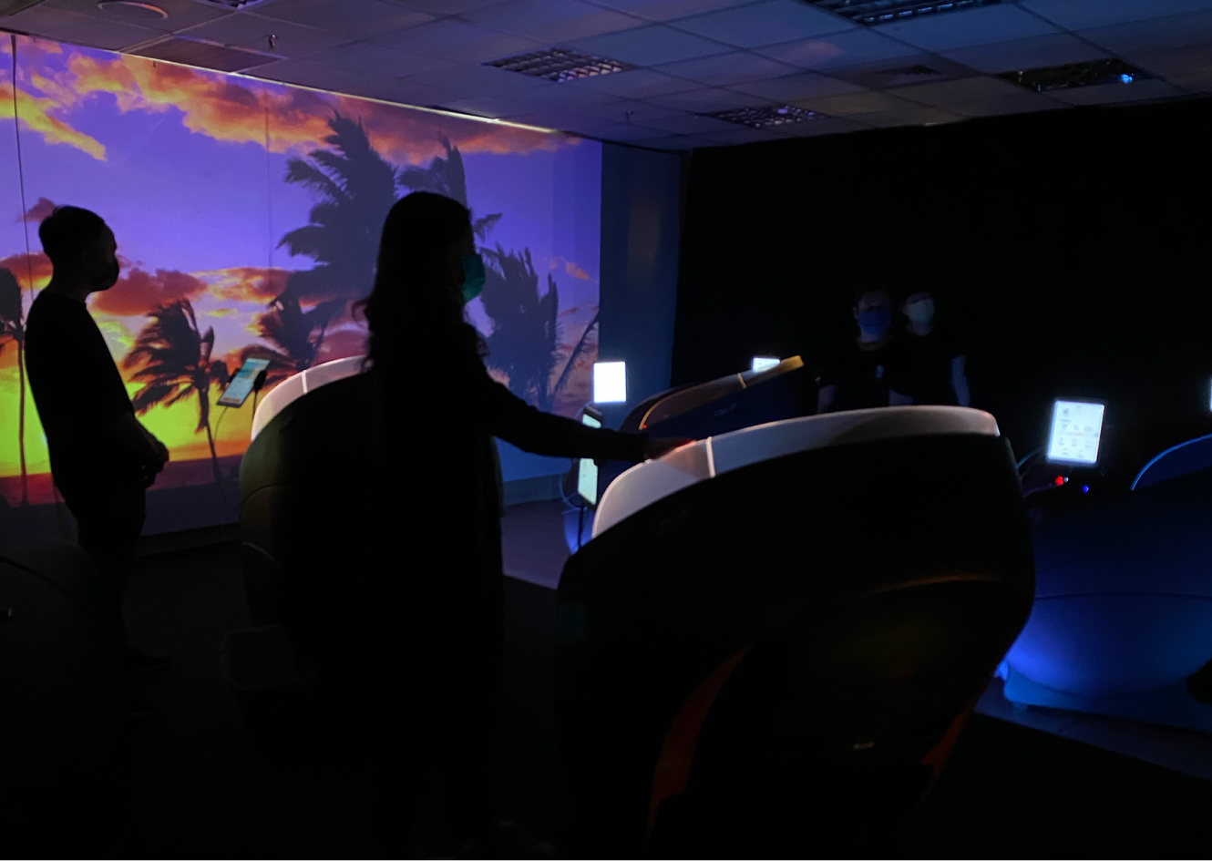
Many massage interactions require users to wait while the hardware operates.
Without clear visualized steps or feedback, users are unsure what the system is doing or how long the process will take.
“Deliver a consistent, low-cognitive-load experience aligned with the brand’s wellness vision.
— Reframed Goal
Design Strategy
Aligned core interactions between the legacy app and the migrated app to preserve user habits.
Ensured a consistent cross-device experience across mobile and tablet.
Consistency
Preserved familiar interaction patterns to maintain a sense of continuity.
Simplified and visualized interaction flows to make system progress and states more transparent.
Smoothness
As more products are planned to migrate, shared interaction patterns were established to ensure a consistent brand experience.
Extendability
Product highlight
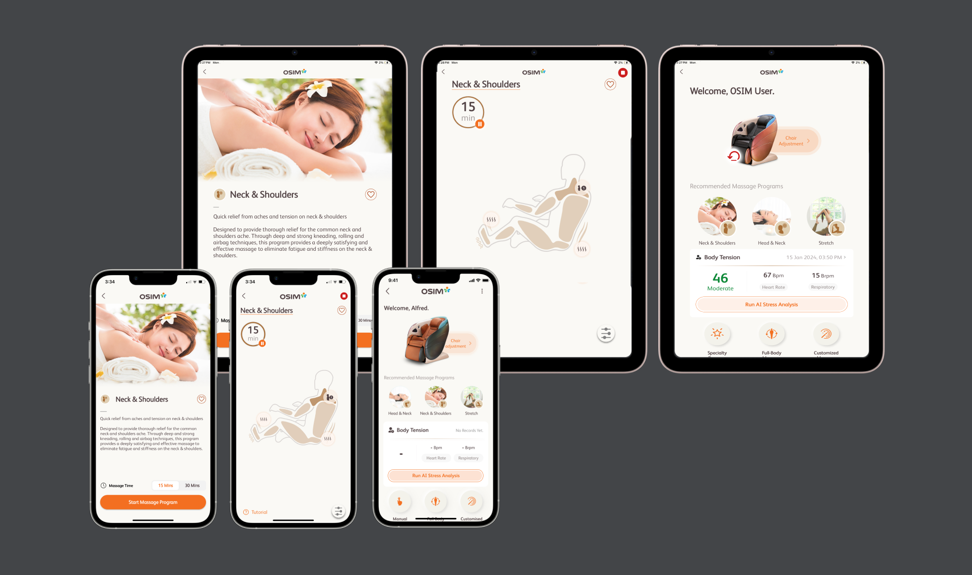
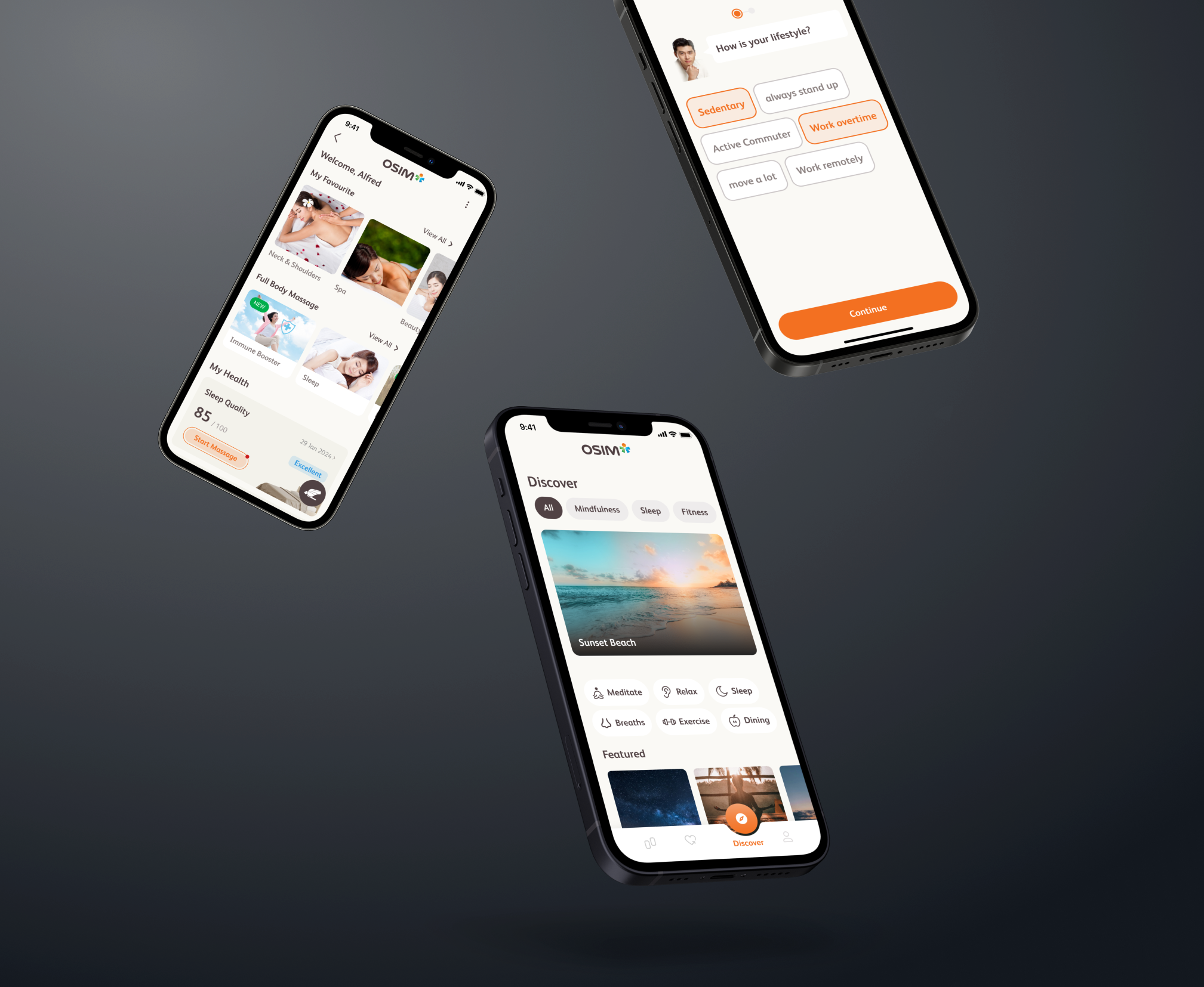
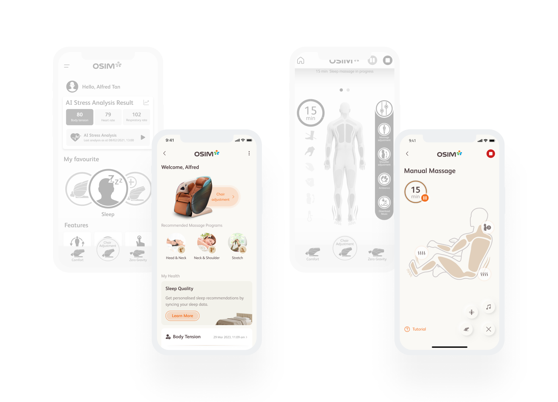
Maintain the same layout logic across devices while adjusting spacing, typography, and interaction density to better support tablet usage.
Reduced relearning effort between mobile and tablet.
Made the experience easier to read and interact with on larger screens without introducing a separate tablet-only design.
Tablet-specific Layout
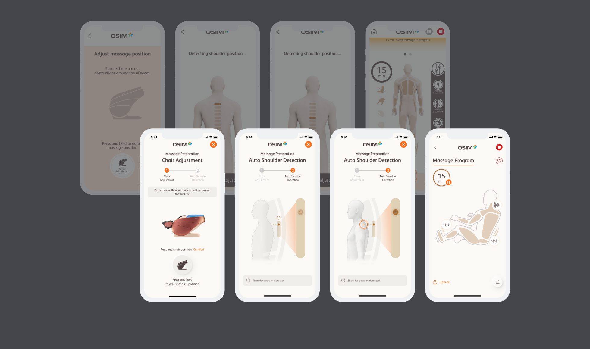
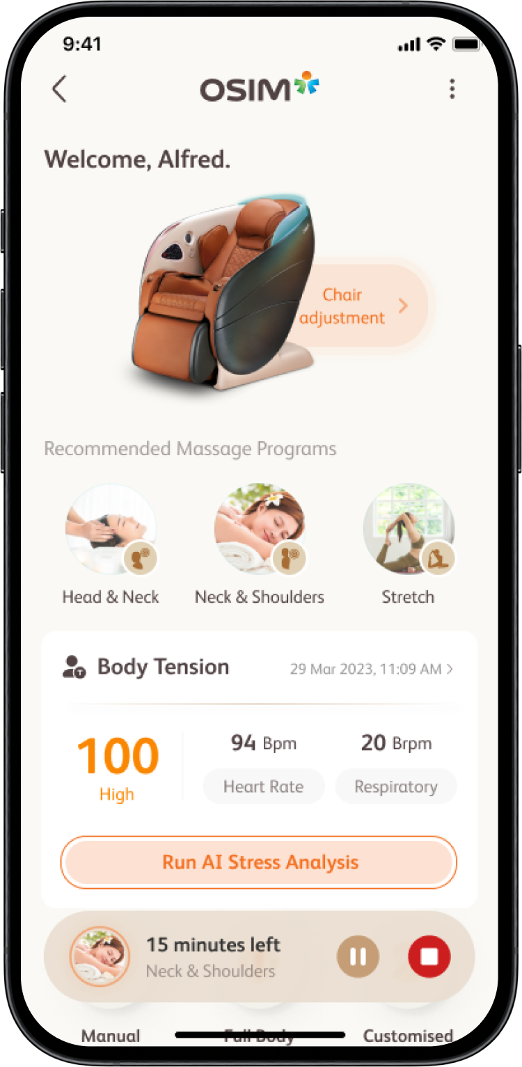
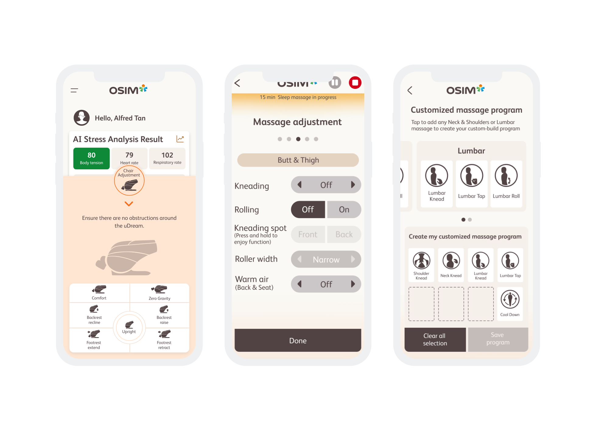
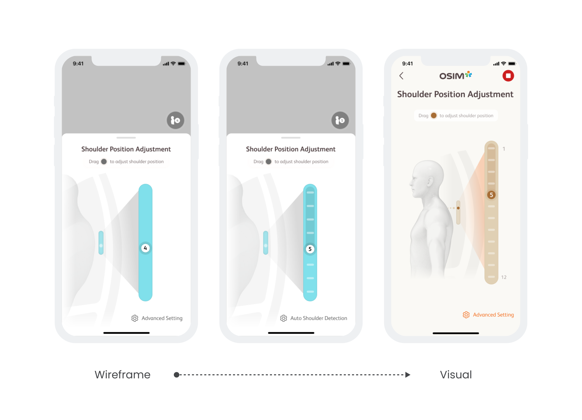
Introduce visualized steps and state indicators to make system progress visible without interrupting the massage experience.
Reduced uncertainty during hardware-driven waiting periods.
Helped users understand what the system was doing and what to expect next.
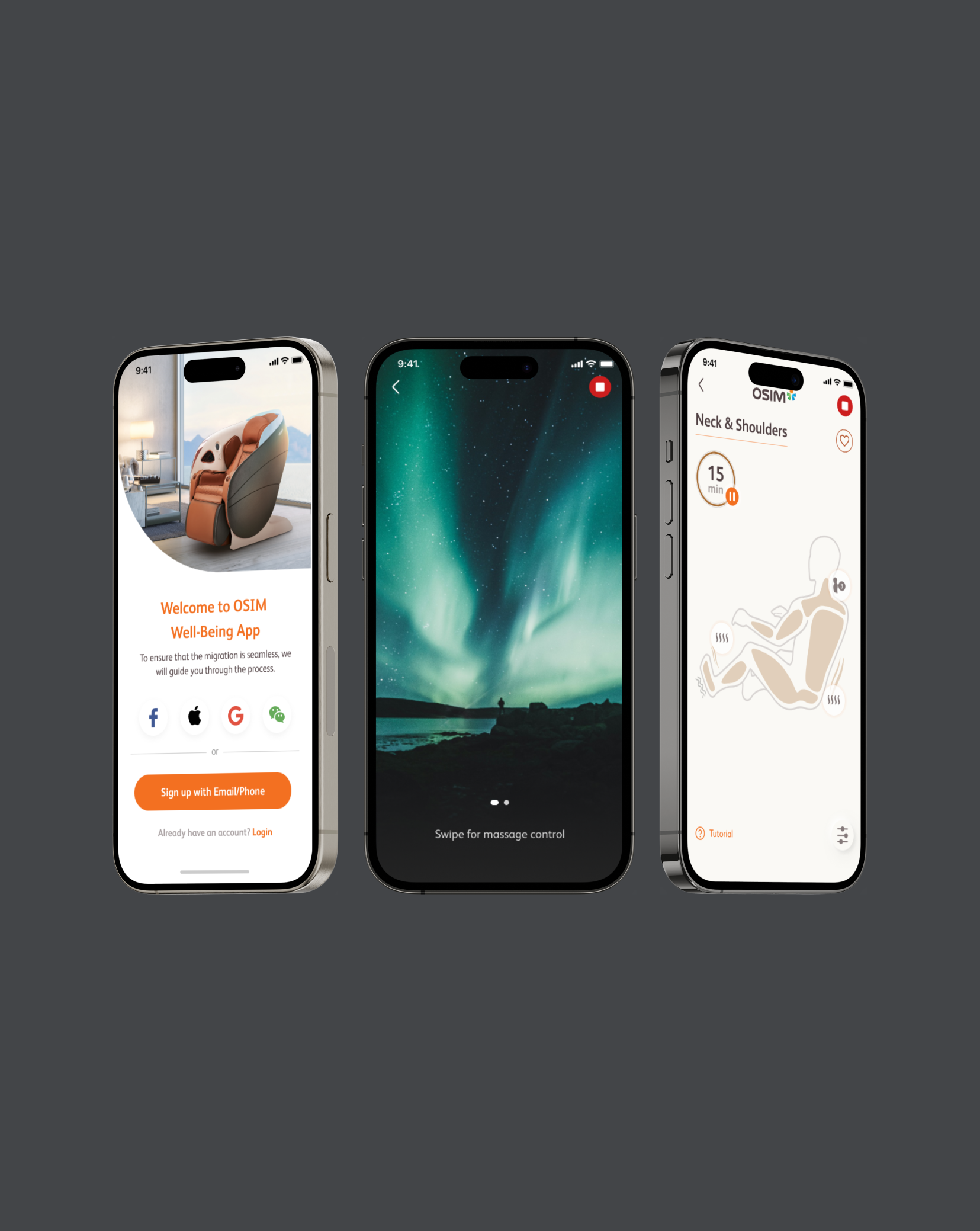
Visualized Guidance For Steps
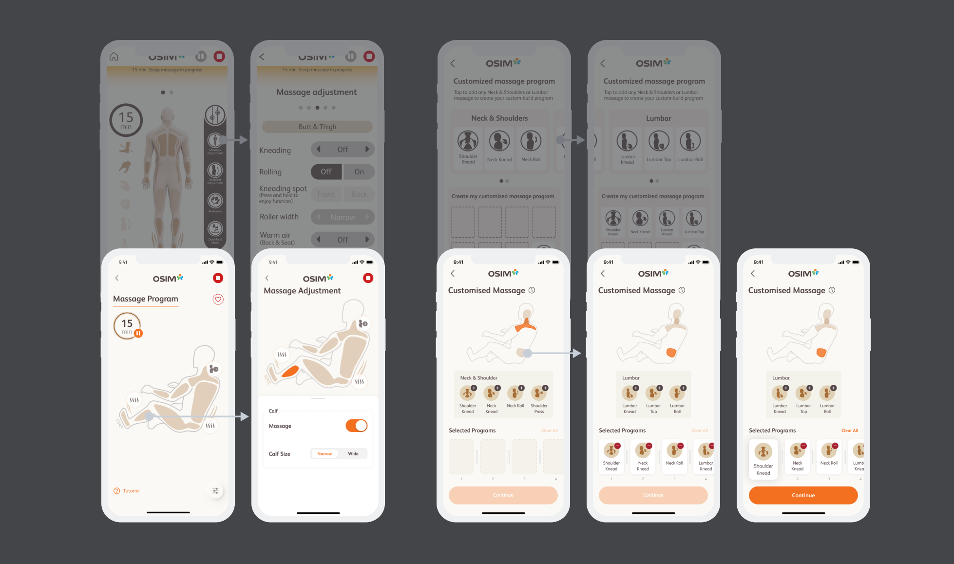
Enhanced Massage Customization
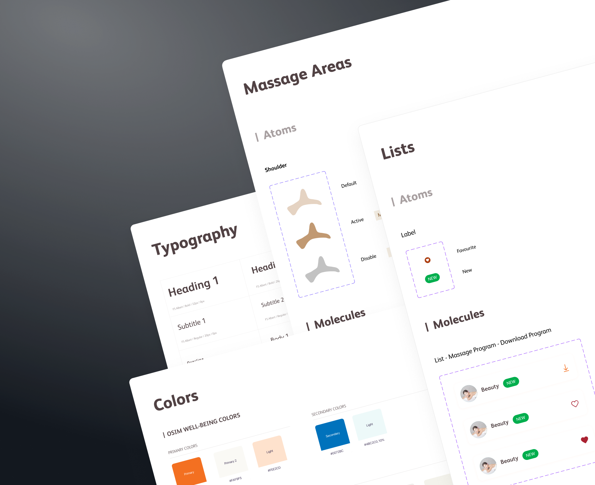
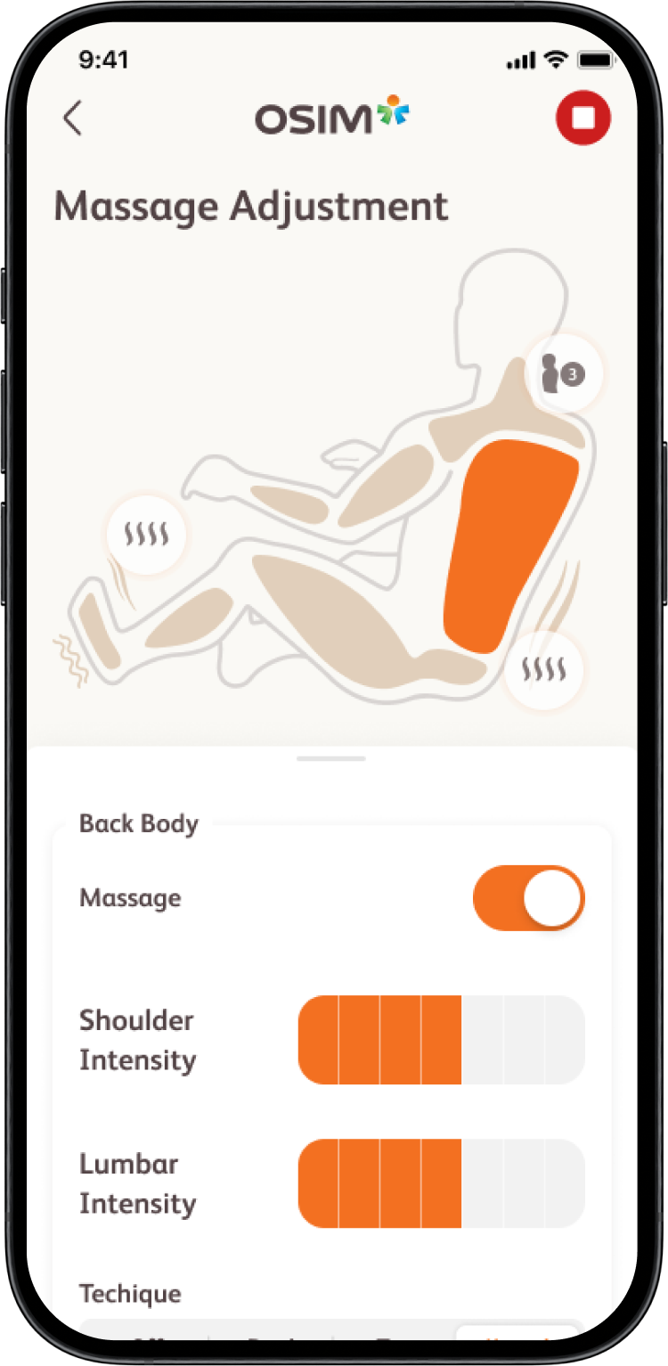
Reframe adjustments around the massage experience by visualizing body areas and allowing direct interaction with massage zones.
Made customization more intuitive and experience-driven.
Reduced cognitive effort while preserving user control.
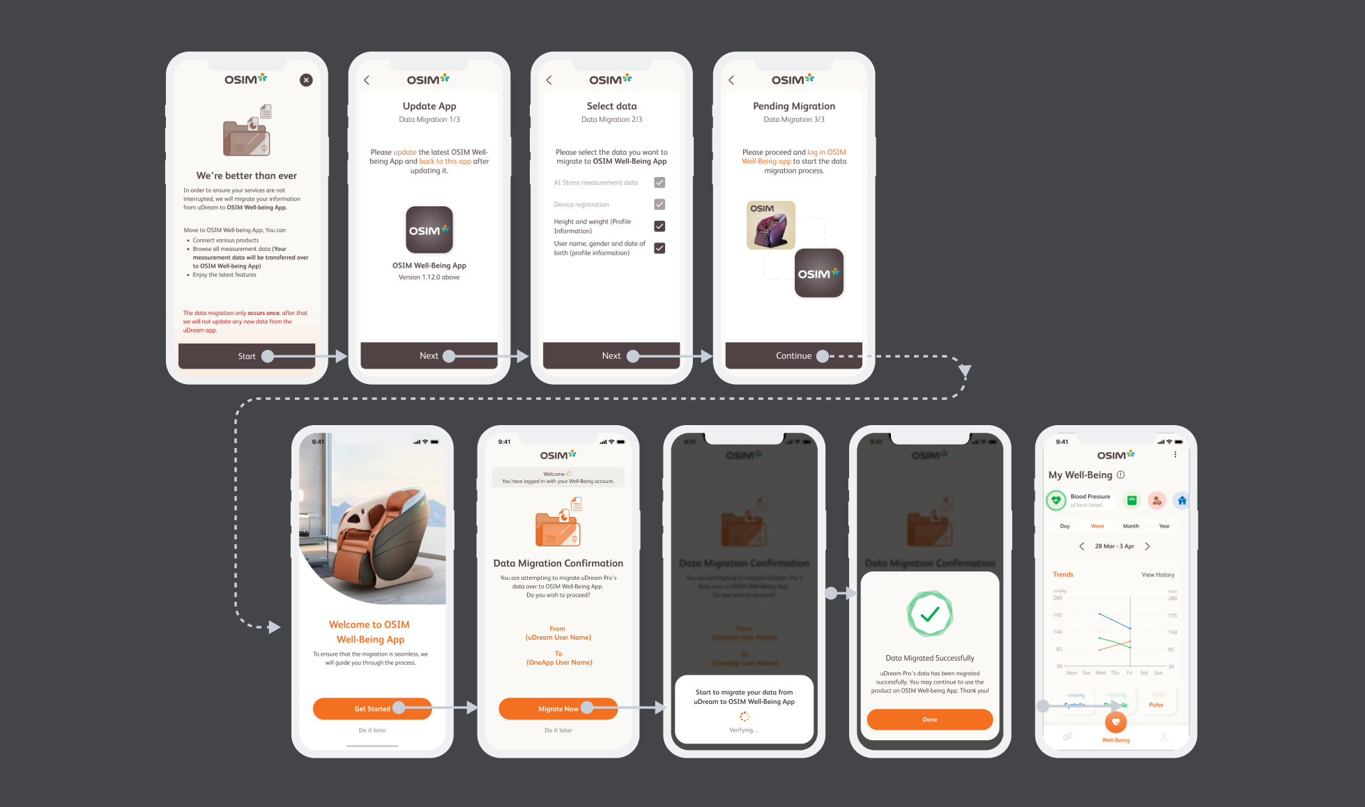
Allowed users to complete migration with minimal relearning.
Reduced reliance on support by providing clear, contextual guidance.
Migration
Impact
90% migration success rate across global markets, indicating a smooth transition for existing users.
5+ regions successfully launched with consistent experience across devices.
99% of sales devices supported, ensuring stability for in-store demos and retail operations.
Takeaway
Aligning Experience Across Constraints
Working within hardware, legacy systems, and cross-device constraints reinforced the importance of aligning design decisions with existing user habits rather than forcing new behaviors
Designing for Migration Requires Restraint
This project taught me that successful migration is less about introducing new features and more about preserving familiar experiences. Small, well-considered changes can have a significant impact on user confidence.